Thursday, December 1, 2011
Follow Up
Forgot to mention, not entirely sure why that post appears so illegible. I messed with it for awhile and then got frustrated. ALSO, totally forgot to post my kern game score. Love this game and have played many a time but sadly on this round I only totaled a 76.
Wednesday, November 30, 2011
Type Reading
What are some ways to indicate a new paragraph?
The most frequently used is indenting the first line of writing. Other options are: hanging or reverse indent, indenting more than an em dash width, a full line of white to separate two paragraphs.
What are some things to look out for when hyphenating text?
The most important "gap makers" on the edges of text are the hyphen and dash. Try to leave at least 2 characters on the line and 3 following, avoid hyphenating proper nouns.
Define font hinting. Why is it necessary?
Font hinting is using a rasterized grid to display letter forms that look right to the human eye. At low screen resolutions, hinting is critical for
producing a clear, legible text.
What is letterspacing/tracking? How do you track in Illustrator or InDesign?
Tracking is the process of loosening or tightening a block of text by adjusting the size of the text height. To manipulate tracking in Illustrator or InDesign, type or select a numeric value for Tracking (looks like A over A) in the Character panel.
Define kerning. Name 8 kerning pairs. How do you kern in InDesign or Illustrator?
Kerning is the process of adding or subtracting space between specific pairs of characters. You can automatically kern type using metrics kerning or optical kerning. Metrics kerning uses kern pairs, which are included with most fonts. Kern pairs contain information about the spacing of specific pairs of letters. Some of these are: LA, P., To, Tr, Ta, Tu, Te, Ty, Wa, WA, We, Wo, Ya, and Yo. To kern in Illustrator or InDesign, type or select a numeric value for kerning (looks like A V) in the Character panel.
What is wordspacing?
Word spacing is the use of white space between words.
Explain DIN
DIN, an acronym for the German Deutsches Institut für Normung (German Institute for Standardization), and the name of an increasingly large realist sans-serif typeface family. The design was based on a 1905 typeface for the Royal Prussian Railway Administration and was originally used for schematics and blueprints. As the typeface grew in popularity, it was released as a metal type, made into stencils for use on vehicles and in train yards, and used for street and building signage. DIN's structure has been accredited as an early forerunner of the typographic grid and widely used by signage and corporate identities around the world.
What is a baseline grid?
The baseline grid is an imaginary grid upon which the type sits. The baseline of a piece of type can be forced to 'snap' to this grid to maintain continuity across the pages of design.
How many characters per line is optimal? Is there a range?
The optimal range is 40-80 words per line.
Define aesthetic text alignment (optically hanging punctuation)
Hanging punctuation controls the alignment of punctuation marks for a specific paragraph. Paragraph alignment determines the margin from which the punctuation hangs. What is a typographic river?
A typographic river appears in a justified text block when the separation of words leaves gaps of white space in several lines. The river effect is created when the separation of words align throughout the body of text.
What is a widow?
A widow is a lone word at the end of a paragraph.
What is an orphan?
An orphan is the final two lines of a paragraph separated from the main paragraph to form a new column and should be avoided at all costs.
Tuesday, November 22, 2011
VISC 204 Album Art
I have chosen to design the album art for rock and roll singer, Buddy Holly's The Apartment Tapes.
Some info I found on the album:
On December 1958, Buddy Holly bought an Ampex tape recorder from Norman Petty. Buddy Holly used this tape recorder in his New York City apartment to record rough takes of new songs that he was writing. In February 1959, as we all know, Buddy Holly died in a plane crash along with Ritchie Valens and J.P. "Big Bopper" Richardson. Many people believe that "It Doesn't Matter Anymore" and "True Love Ways" were Buddy Holly's last songs.
After his death, Buddy Holly's tape recorder was located in his apartment building. On this tape, there were 14 full songs that Buddy Holly recorded. The songs were, in general, very clear and very personal. Most were just Buddy Holly and his acoustic guitar. These songs were truly Buddy Holly's last songs.
The original tapes were given to two producers, Jack Hansen and Norman Petty. Both producers used the recordings and overdubbed them with a full band so the songs would be more radio-friendly. These versions of the songs were released to the public, and some of the songs even became hits. But the original raw recordings Buddy Holly made in his apartment never saw an official release.
POSSIBLE CONCEPTS:
-Focus on his death/ the plane crash/ slightly morbid
-photo of the ampex tape recorder that was used for recording
-buddy holly's iconic glasses
-retro 50's tacky look, snapping fingers
Wednesday, November 16, 2011
On Newsstands
Who is Herb Lubalin? Partner in publishing the 1960's magazines: Eros, Fact & Avant Garde. Lubalin was given free reign in the design.
Why was Esguire important? First lush style magazine published for men. Art direction is richly storied with designers like Paul Rand and Milton Glaser.
Who is Alexy Broadavich? Designer hired to help revolutionize the design of the magazine. Broadavich took pleasure in the white space and finely tuned pacing of text and image.
What did Hoefler-Jones do for Harper"s? Introduced the magazine's Didot type family.
Who is Gail Anderson? Fellow art director for Rolling Stone, offered some of the most venturesome double-page spreads of the 1990's.
Who is David Carson? Inaugural art director for Ray Gun. His pages were kinetic and engaging.
Who is Tibor and what is M&Co? Tibor is the designer for Colors magazine. He directed a unique magazine with little design to give emphasis to the photography and content. M&Co was his New York studio that he closed to move to Rome and focus entirely on Colors.
Who is Neville Brody? Art director for The Face, instituted a highly expressive design. Introduced a custom typefaces. Contorted letterforms. Mixed typography with graphic symbols.
What is Speak? A magazine that sought to cover thoughtful writing on culture, loosely covering music, fashion, literature and art. First issue released in 1995.
Photogs
After perusing all 50 photographers, I found myself liking all the same styles. Hard to narrow down. Here are the six finalists:
Horst P. Horst


 Testino has become one of the world's most well known and celebrated fashion photographers. His work has been featured across the globe in magazines such as Vogue, Vanity Fair and V and he has crafted and contributed to the imagery of leading fashion houses such as Burberry, Gucci, Versace, Calvin Klein, Dolce & Gabbana, Salvatore Ferragamo, Estee Lauder, Hugo Boss, Miu Miu, Shiseido and Michael Kors, among many others. As well as having published nine books of his work and edited one other dedicated to contemporary art and artists from his native Peru, Mario Testino has had many successful exhibitions in galleries and museums around the world.
his page some work
Terry Richardson


Terry Richardson is an international celebrity as well as one of the most prolific and compelling photographers of his generation. Known for his uncanny ability to cut to the raw essence of whomever appears before his lens, Mr. Richardson's vision is at once humorous, tragic, often beautiful, and always provocative.
http://en.wikipedia.org/wiki/Terry_Richardson http://www.terryrichardson.com/bio.html
Tim Walker
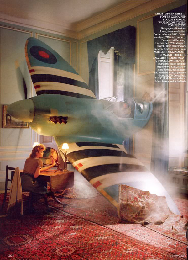

Tim Walker is a photgrapher based in London. Tim’s interest in photography began during work experience at Condé Nast where he set up the Cecil Beaton archive.
http://visualstreak.com/2008/06/07/tim-walker-fashion-photographer/ http://www.timwalkerphotography.com/
William Eggleston

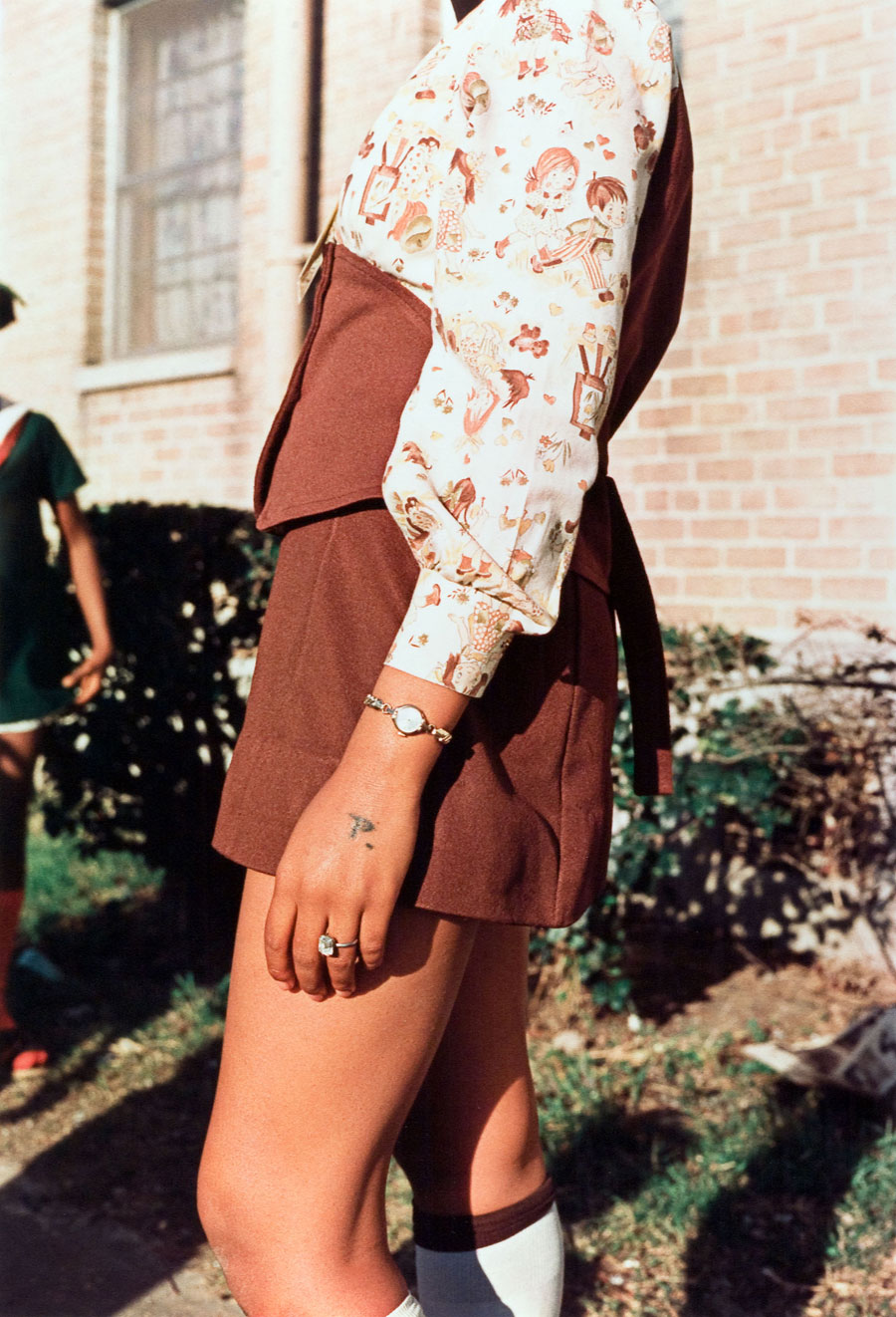
William Eggleston (born July 27, 1939), is an American photographer. He is widely credited with increasing recognition for color photography as a legitimate artistic medium to display in art galleries—which, until the 1970s, often tended to privilege work by photographers making black-and-white prints.
http://www.imdb.com/name/nm1206729/bio http://www.egglestontrust.com/
Yousuf Karsh


http://www.biographybase.com/biography/Karsh_Yousuf.html http://www.karsh.org/
Horst P. Horst

Horst P. Horst (most often known as just Horst) was a photographer best known for his photographs of women and fashion taken while working for Vogue. Horst rented an apartment in New York in 1937, and while residing there met Coco Chanel, whom he called "the queen of the whole thing". He would photograph her fashions for three decades. Horst is best known for his photographs of women and fashion, but is also recognized for his photographs of interior architecture, still lifes, especially ones including plants, and environmental portraits. His method of work typically entailed careful preparation for the shoot, with the lighting and studio props arranged in advance. His published work uses lighting to pick out the subject.
Mario Testino
his page some work
Terry Richardson
Terry Richardson is an international celebrity as well as one of the most prolific and compelling photographers of his generation. Known for his uncanny ability to cut to the raw essence of whomever appears before his lens, Mr. Richardson's vision is at once humorous, tragic, often beautiful, and always provocative.
http://en.wikipedia.org/wiki/Terry_Richardson http://www.terryrichardson.com/bio.html
Tim Walker
Tim Walker is a photgrapher based in London. Tim’s interest in photography began during work experience at Condé Nast where he set up the Cecil Beaton archive.
http://visualstreak.com/2008/06/07/tim-walker-fashion-photographer/ http://www.timwalkerphotography.com/
William Eggleston
William Eggleston (born July 27, 1939), is an American photographer. He is widely credited with increasing recognition for color photography as a legitimate artistic medium to display in art galleries—which, until the 1970s, often tended to privilege work by photographers making black-and-white prints.
http://www.imdb.com/name/nm1206729/bio http://www.egglestontrust.com/
Yousuf Karsh

http://www.biographybase.com/biography/Karsh_Yousuf.html http://www.karsh.org/
Tuesday, November 15, 2011
VISC 204 Infographics
Finally completed my series of infographics and construction! Check it out on my Behance
http://be.net/rachroth
http://be.net/rachroth
Monday, November 14, 2011
Letter Fountain Reading
What are small capitals? How are they different than something set in ALL CAPS?
Does your font have small caps? If not name a font that does.
Small capitals are smaller versions of capitals. They are not reduced capitals, but separately designed small capitals with an x-value that is generally higher than the lowercase letters. The stem weight is adjusted to suit the lowercase. They are used for texts containing lots of initials, abbreviations in capitals or words in capitals. From what I saw, Rockwell does not have small caps.
What are ligatures? why are they used? when are they not used? what are common ligatures? Does your font have ligatures? If not name a font that does.
Ligatures are fixed character combinations, used to avoid unattractive overlapping in normal print work of characters that could collide. If extra letter spacing is used in a text, ligatures aren't used and combinations of characters have to be set separately. Rockwell has ligatures.
What is the difference between a foot mark and an apostrophe?
An apostrophe is similar in form to a comma but placed higher and used to indicate the omission of one or more letters in a word, to indicate possession, or to indicate plurals in numbers. A foot mark is used to indicate measurement in feet.
What is the difference between an inch mark and a quote mark (smart quote)?
An inch mark is used to indicate measurement in inches. A quote mark is placed at the beginning and end of a word, quotation, piece of dialogue, or phrase use to indicate that the words do not originate with the narrator.
What is a hyphen, en dash and em dashes, what are the differences and when are they used. A hyphen is used as a symbol to break words. It is used to prevent big gaps and ugly breaks in a block of text. An example is 'pre-school.' An en dash is longer than a hyphen and is used to demarcate a parenthetical thought or to indicate a sudden change of direction. An em dash is used to demarcate parenthetical thought in English texts and the dashes are unspaced.
Thursday, October 27, 2011
Rockwell Context
Rockwell was conceived by Frank Hinman Pierpont and his design team at Monotype in 1933. They designed the font as a slab serif out of commercial necessity.
The origins of Slab Serif typefaces began in the early nineteenth century, as clients were demanding a new sort of “display” typeface. The first typeface design that met the new demands was the “fat-face,” which has been attributed to Robert Thorne (1754-1820). Thorne’s methodology integrated the contemporary vogue of the continental Modern face and increased the stroke thickness to a staggering degree. This particular brand of display type would inform Slab Serif designs years later. It was Vincent Figgins, a competitor of Thorne’s, who introduced the first Slab Serif typeface in 1815, which he named “Antique”.
Slab Serif typefaces have several monikers, including Square Serif, Mecanes, Antiques, or Égyptienne; the latter appellation derived from budding interest in Napoleon’s Egyptian campaigns. According to Tara Rabinowitz in Exploring Typography, “The name Egyptian refers to the heavy, horizontal aesthetic of ancient Egyptian art, architecture, and hieroglyphics; the typeface gained popularity at about the time of Napoleon’s conquest of Egypt” (Rabinowitz 123). Following Napoleon’s campaigns (1798-1801) as part of the French Revolutionary War, publications such as Description de l’Égypte ou Recueil des observations et des recherches qui ont été faites en Égypte pendant l'expédition de l'armée française (1809) disseminated images of Egypt and constructed an identity of Egypt, the Orient, and the exotic Other. In Europe, such imagery spurred a cultural fascination for all artifacts Egyptian. Accordingly it was not uncommon for Slab Serif typefaces to have a metonym suggesting Egyptian connotations (such as Cairo from Intertype, Karnak from Ludlow, and Pharaoh from Deberny & Peignot).
Egyptian typefaces were widely used in poster designs around the turn of the twentieth century. Slab Serif typefaces developed from large-scale, “fat-face” display letters used in woodblock letter-pressing, but the robust letterforms (thanks in part to the hefty serifs) made the Slab Serif letterforms very resilient to metal casting reliefs. Because new technologies in offset lithography technology permitted cheap and efficient print advertisements that branched beyond the familiar realm of books, designers began developing bold, decorative typefaces. The chunky appearance and heavy serifs of Egyptian typefaces are easily recognizable and grab the attention of their audience, making them ideal for this application. As a result, Slab Serifs figure prominently in posters, playbills, and other promotional materials due to its bold display.
The Slab Serif designs of the twentieth century were more refined than the Egyptians of the previous century. Slab Serifs have no bracketing and are generally mono-linear. Overall, these letterforms have a robust, square appearance, and the character width tends to be wider than other typestyles. This robust appearance may be attributed to the large x-height, making Rockwell suitable for brochures and advertising work. Since Slab Serifs are bold and big, they are most commonly used in large headlines and advertisements but are seldom used in body text. The exception is in mono-spaced text, many fonts for which are modeled on the typefaces used in typewriters, but that is declining in the wake of electronic publishing. Another recent exception is the typeface designed for The Guardian newspaper in the UK which is an Egyptian used through the paper as body text. Looking towards the history of Slab Serif fonts we see that as printed material began to branch out from the familiar realm of books, new typefaces were needed for use in advertising, posters, and flyers. Vincent Figgins, first commercially introduced slab serif printing type under the name Antique, with copies of specimen dated 1815 and 1817.
The design of Rockwell and other Egyptian typefaces employ subtle optical adjustments to prevent the type from feeling too heavy and dark. Egyptian typefaces are generally heavy, have low contrast, and often have a vertical angle of stress—if any at all. Typically the typefaces feature unbracketed Slab Serifs of equal thickness to the main strokes; however, the less familiar Italienne variety features slabs that are heavier than the stroke width. Rockwell creates enabling links and patterns composed of the letters. The chacracters have a geometric face with well-defined slab serifs, a fairly high x-height and noticeably short descenders. It is available in four weights and nine fonts, the roman weight is monolined with a serif od equal thickness, while the bold weight has a slight contrast. The bar apex of the uppercase ‘A’ and the deep serifs serve to reinforce the horizontal or linear qualities emphasis of the typeface.
The day Ottmar Mergenthaler demonstrated the first linecasting machine to the New York Tribune in 1886, Whitelaw Reid, the editor, was delighted: “Ottmar,” he said, “you’ve cast a line of type!” The editor’s words formed the basis for the company label, and marked the beginning of Linotype’ s success story. Four years later, the ingenious inventor founded the Mergenthaler Linotype Company. Little did he know that after more than 100 years of successful business the Linotype, a wholly-owned subsidiary of Monotype Imaging Holdings Inc., would be following in his footsteps. Today, Linotype has one of the world’s largest font libraries, offering more than 10,500 high-quality typefaces. Linotype’ s goal is to be a partner for designers and typographers, and to support a global transfer of know-how and an open exchange of ideas and information in the field of typography. The ambitious and qualified staff at Linotype are dedicated to meeting this objective and making it reality.
The Linotype typesetting machine is a "line casting" machine used in printing. The name of the machine comes from the fact that it produces an entire line of metal type at once, hence a line-o'-type, a significant improvement over manual typesetting. The Linotype machine operator enters text on a 90-character keyboard. The machine assembles matrices, which are molds for the letter forms, in a line. The assembled line is then cast as a single piece, called a slug, of type metal in a process known as "hot metal" typesetting. The matrices are then returned to the type magazine from which they came. This allows much faster typesetting and composition than original hand composition in which operators place down one pre-cast metal letter, punctuation mark or space at a time. The machine revolutionized typesetting and with it especially newspaper publishing, making it possible for a relatively small number of operators to set type for many pages on a daily basis. Before Mergenthaler's invention of the Linotype in 1884, no newspaper in the world had more than eight pages.
The designer Frank Hinman Pierpont (born 1860 in New Haven, died 1937 in London) created the font Plantin® in 1913. Pierpont is also known for his many technical inventions and improvements in the Monotype machine park and for his contribution to the development of the revival typeface Plantin. Plantin, the man, was a well-known printer of the 16th century whose font foundry turned out traditional Old Face fonts and the italic cut of Garamond. Frank Hinman Pierpont designed Plantin, the font, based on such fonts, and Stanley Morison and Victor Lardent in turn based their Times New Roman™ design on Plantin. In the style of Garamond, this font is exceptionally legible and makes a classic, elegant impression.
Thursday, October 13, 2011
In Class Group Type Studies
Oldstyle: 1435
- Axis of thick-thin contrast slopes slightly to the left
- Cross-bar of the lowercase 'e' is horizontal
- Top serifs are roof-shaped and have triangular form
- Base serifs have no or hardly any rounding at bottom
- Examples: Bembo, Garamond, Palatino, Plantin, Albertina
Transitional: 1750
- Axis of thick-thin contrast is almost vertical or slopes very slightly to the left
- Base serifs are only a little or virtually not rounded at the bottom
- Lowercase 'e' has horizontal cross-bar
- Top serifs of lowercase letters are roof-shaped
- Serifs sometime rounded, sharpened, or horizontal
- Examples: Baskerville, Concorde, Fournier, Perpetua, Times New Roman
Modern: 1775
- Typefaces that have a high thick-thin contrast
- Serifs sometimes rounded, sharpened, or horizontal
- Vertical stress axis
- Thin serifs
- Emphasis on vertical stroke, sharp contrast, symmetry, and sharp transition to straight serifs
- Examples: Bodoni, Didot, Walbaum, Linotype Centennial, Vertrina
Slab: 1800's
- Heavy, rectangular serifs
- Serif weight is almost as thick as the letter itself
- Terminals may be blunt, angular, or rounded
- Examples: Clarendon, Rockwell, Beton, Egyptienne, Courier
Sans-Serif Grotesk (and Gothic): 1920's
- Line thicknesses seem to be equal, but have a slight visual thick-thin contrast
- Ascender height is usually equal to the capital height
- The cure of the lowercase 'e' is pointed up towards the crossbar
- The lowercase 'g' has an open curve that ends pointing upwards
- Examples: Akzidenz Grotesk, Helvetica, Univers, Arial, Futura
Sans-Serif Humanist:
- No serifs
- Line widths are visually equal
- Extension on lowercase 'e' points to right instead of turning toward the cross-bar
- Lowercase 'g' often has classic form with two 'bowls'
- Characters have more distinguishing forms than those of other sans-serifs
- Examples: Gill Sans, Profile, Frutiger, Scala, Myriad
Sans-Serif Geometric:
- No serifs
- Axis of roundings is vertical
- Letters seem to have been drawn using ruler and compass
- Line thicknesses are only visually and minimally corrected
- Examples: Futura, Avenir, DTL Nobel, Erbar, Eurostile
Font Intro to Rockwell
My font is Rockwell. Frank Hinman Pierpont and his design team at Monotype designed the font in 1933 as a slab-serif. Pierpont is also known for his many technical inventions and improvements in the Monotype machine park and for his contribution to the development of the revival typeface Plantin.
Rockwell has geometric construction whereby both the capital 'O' and the lowercase 'o' are almost circular. Another characteristic is the upper serif of the capital 'A.' The serifs have the same thickness as the other lines and there is almost no thick-thin contrast. In general, the bold styles are most often used for headings and larger display texts.
Rockwell has geometric construction whereby both the capital 'O' and the lowercase 'o' are almost circular. Another characteristic is the upper serif of the capital 'A.' The serifs have the same thickness as the other lines and there is almost no thick-thin contrast. In general, the bold styles are most often used for headings and larger display texts.
Monday, September 19, 2011
Thursday, September 8, 2011

Sir Frutiger
Adrian Frutiger is a distinguished typeface designer rooted in Switzerland. He has created a variety of fonts but most notably Univers and Frutiger. Univers was rare for its time because it was the first type family to use numbers to name the variousweights associated with the typeface. Built around the Roman version, Frutiger released a total of twenty one variations. Univers is special in that it uses even strokes, as well as x-height increases legibility when used in very large or very small fonts. In 1997, Frutiger used the linotype to expand this typeface totaling 63 fonts.
The Univers grid was introduced in 1957 along with the typeface. The grid is basically a visual way of displaying the different variations of the typeface. The grid can be read in multiple directions and additionally, is color coded. Each of the displayed even numbers are italic. Reading from left to right, the typeface descends from extended to condense. Top to bottom shows light to heavy, odd numbers are Roman. Glancing across the grid, each row has the same stroke width.
The Univers grid was introduced in 1957 along with the typeface. The grid is basically a visual way of displaying the different variations of the typeface. The grid can be read in multiple directions and additionally, is color coded. Each of the displayed even numbers are italic. Reading from left to right, the typeface descends from extended to condense. Top to bottom shows light to heavy, odd numbers are Roman. Glancing across the grid, each row has the same stroke width.
Thursday, August 25, 2011
CHANGE OF SCHEDULE
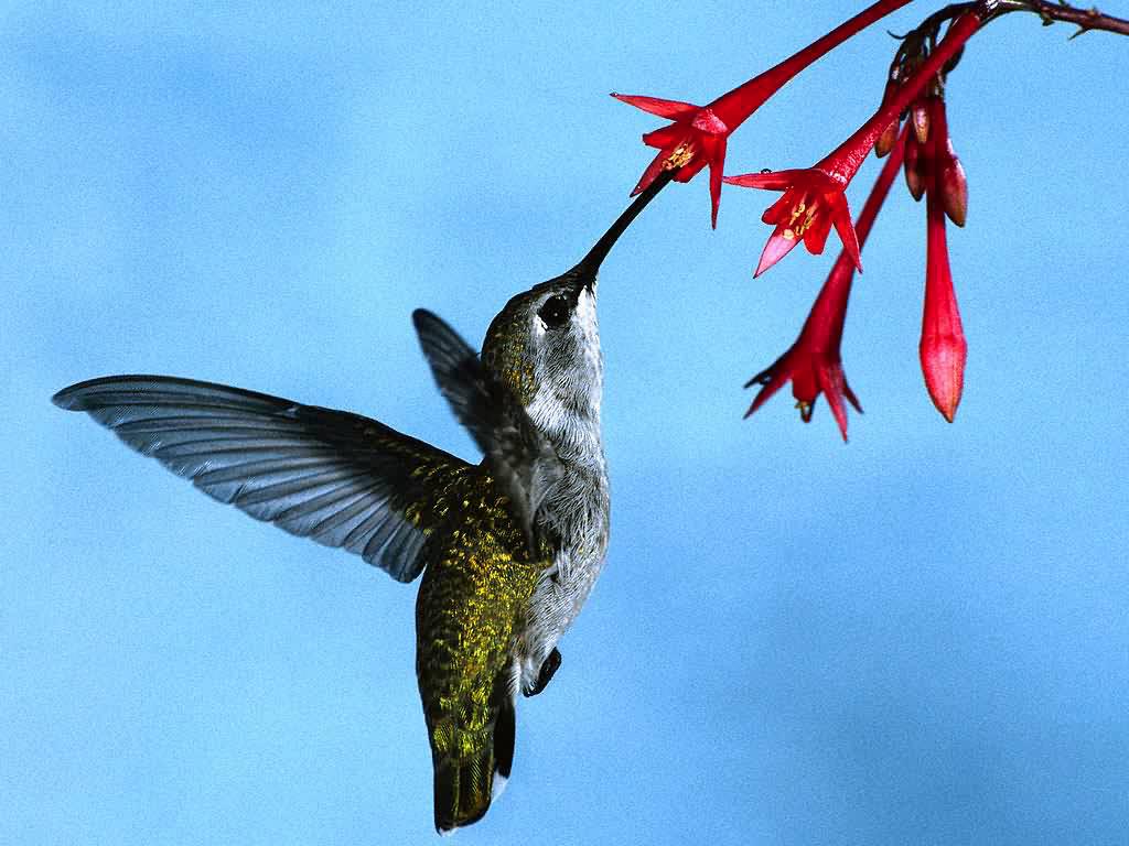
Seahorse seemed to be a common theme in the classroom on Wednesday so I have decided to revert back to my original list of options. I think I am going to go ahead with the hummingbird, however, the bat remains in my thoughts. I am starting on my word lists and will hopefully reach a solid conclusion after.

VERSUS

VERSUS
Looks like it is a matter of pretty or creepy......
Wednesday, August 24, 2011
FIRST TYPE HOMEWORK
ANSWERS
The grid is the underlying structure on which the information is presented and positioned.
Designers use a grid in order to make a layout more manageable. With the guidance of the grid, one has the ability to express the necessary information in a logical, navigational manner. Essential to a layout, the grid is a structure made of vertical/ horizontal lines, which provide a framework to place text, images and space accordingly.
With a modular grid, the designer breaks down the space into smaller portions that can be independently created and provide different systems for different functionalities within one area.
Margins are the areas not accommodated by text, usually on the outer edges of a page. Modules form columns. The columns maintain consistent line length across the page. Narrow columns give the designer more flexibility and an odd number of columns are more versatile, especially when dealing with secondary information. Grid modules are areas calculated in depth by the text leading and width by the text line length. Flowlines are the vertical lines of the modules. There are horizontal and vertical gutters. These are the inner margins of the page that separate modules from one another.
Hierarchy helps readers comprehend the text and understand how all the information fits together. It breaks up the important information using different types, sizes, and styles in the headings and subheadings etc..
Typographic color deals with the overall tone of letterforms or a block of text on a page. Designers must make sure they have enough contrast between the background and text so the two do not blur together. Color can also be used for emphasis or to organize different sets of information.
Getting it Right with Type suggests clear hierarchy develops from the division of sections. Chapters, headings, and subheadings categorize the importance for a reader. However, there should be no more than four hierarchal levels as too many headings can create confusion. Text helps as well depending on size and weight.
White space is any area of a spread or layout that is left blank/ unoccupied. The white space must be carefully placed in order to avoid interrupting the reader. It also provides variety by breaking up any monotonous pace.
Contrast enhances the brightness or clarity of a design through the juxtaposition of different colors or textures. This places higher attention to desired areas with the degree of difference between tones.
MADE
Our first class experience was to create a type using anything found on campus. Jordan and I spent our time experimenting with the various eating accesories in the Underground. We had two, final favorites:


Tuesday, August 23, 2011
PROJECT 1A
THE TIME HAS COME TO SELECT AN ANIMAL FOR OUR REPRESENTING SOMETHING PROJECT AND I HAVE A FEW NOMINEES THAT COME TO MIND:
SEAHORSE
HUMMINGBIRD
SHARK
SPIDER
BAT
HOWEVER, I THINK I AM GOING TO GO FORWARD WITH SEAHORSE.
I HAVE ALWAYS BEEN FASCINATED BY THESE MYSTICAL SEA CREATURES AND THINK THEY COULD WORK NICELY FOR THIS ASSIGNMENT. HERE ARE SOME FACTS THAT MAKE SEAHORSES ALL THE MORE ENTICING:
THEY USE THEIR TAILS TO GRAB ONTO THINGS SUCH AS CORALS AND SEA GRASSES
THEY ARE MONOGAMOUS AND SHARE A MATE FOREVER
THEY ARE PART OF THE ONLY ANIMAL SPECIES ON EARTH WHERE THE MALE CARRIES THE YOUNG
THEY RANGE FROM 0.6-14 INCHES LONG
WHEN MATING, THE FEMALE DEPOSITS HER EGGS INTO THE MALE'S POUCH UNTIL THEY HATCH AND
THEN HE RELEASES MINIATURE SEAHORSES INTO THE WATER
I (HEART) DESIGN
Tuesday, April 26, 2011
Wednesday, April 20, 2011
CHAIR IDEAS
I have certainly been neglecting this blogger. Book project is complete and submitted and now it is time to fire up the final project of the BDS class, the chair. From observing others and considering the projects I have produced this semester, I aim to design a simple chair that appears clean and yet still visually appealing, particularly dominantly geometric. Plucked from a lengthy picture document, these few pictures are my favorites as of now....


hopefully with some of these structures in mind, I can make a simple, geometric chair preferably in the shape of a cube somehow (would like a smaller chair without a back rest). I am also considering painting the future chair white, if that is an option. Here we go!
hopefully with some of these structures in mind, I can make a simple, geometric chair preferably in the shape of a cube somehow (would like a smaller chair without a back rest). I am also considering painting the future chair white, if that is an option. Here we go!
Monday, March 28, 2011
book brainstorm
Ok, pretty confident that I am going to use making stove top popcorn as my experience. I have been making a wordlist and browsing some pictures and book ideas. Some ideas that I am flirting with are: pop ups, twist on the accordion book, use of kernels or possibly stringed popcorn? I figure the main components of making stove top popcorn are the kernels, olive oil, the physical popping, salt, pepper, oven, and the pot. Here are some images that will hopefully steer me in some particular direction.
Check out the 4 books EVelin Kasikov made neato books


Check out the 4 books EVelin Kasikov made neato books
 | |
| Evelin Kasilkov, strips of photo (diff times) |
Saturday, March 26, 2011
Milan Design Week- Salone del Mobile
I just stumbled upon this design competition held in Milan every April. It is the largest decoration trade fair in the world and as you would guess, some pretty neat showcases. This website shows some from 2010 http://www.coolhunting.com/design/milan-design-we-11.php
in a bind over the book
I have ideas for my experience that will be represented in our book but have yet to finalize my selection, some ideas....
-making stovetop popcorn (yum)
-swinging in south park
-making a origami butterfly
Thursday, March 10, 2011
poster inspirations
eric carle illustration

rudi de wet studio work

and some tad carpenter work

basically I want the poster to have a collage feel to it that mirrors the collage model of my treehouse. It is about color and materials. i have decided to use handwritten text instead of a computer font, and eliminate any boxes around pictures. sketches
Tuesday, February 8, 2011
fridge becomes personal chef
http://www.yankodesign.com/2010/05/28/smart-fridge-is-your-new-recipe-card/
Subscribe to:
Comments (Atom)